A big welcome to CustomMessageBox, a new control to the toolkit which is exactly what it sounds like, a customizable, Windows Phone-UI compliant, easy to use message box offering the following features:
- Native look & feel including font sizes, layout, alignment and animations
- Ability to display full screen or to only consume as much space as needed
- Very simple “basic” mode with ability to easily extend it to complex scenarios
- Customizable buttons without needing to re-template
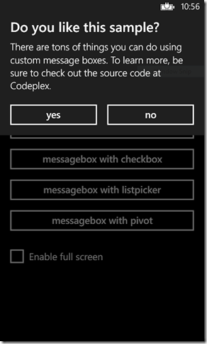
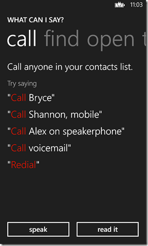
Here is what it looks like, from the basic (a message and some buttons) to the complex (a full screen message box with an embedded Pivot):
Getting Started
As of today (9/30/2012) you’ll need to download the latest source from CodePlex and recompile the toolkit assembly to use it but we’ll soon have an updated NuGet package for your convenience. As usual add a reference to the Microsoft.Phone.Controls.Toolkit.dll to your project and add the toolkit XML namespace to the top of your XAML:
|
|
Basic Usage
The basic usage is very similar to the default MessageBox and how you’re probably used to using dialogs in other UI platforms; set some properties, call Show(), handle the event that is raised when the user returns from the dialog.
Possible values to customize are:
Caption- sets the title caption of the message boxMessage- the actual message to display to the userLeftButtonContent,RightButtonContent- the buttons that appear on the bottom of the dialog, if you omit the text then the button won’t be shown.
To handle the user’s selection hook up the Dismissed() event and look at the e.Result value which is of type CustomMessageBoxResult indicating which, if any, button was tapped. If the user presses the back button vs. making a selection the result will be None.
Finally to kick-off the whole process call Show(). Show() is non-blocking so be aware that any code you put after the Show() call will run before the user has made a selection.
By default the the message box only takes up as much space as required but you can force it to full-screen by setting the property IsFullScreen to true.
Simple Example
To recreate the first message box in the screen shot do the following in code-behind:
|
|
The title caption, message and buttons are configured, the Dismissed() event is assigned a handler and finally the Show() method is called to kick off the party.
Taking It Up A Notch
That’s all well and good but where is the real “custom” part of the CustomMessageBox? That comes in with the Content property where you insert your own content into the overall layout. You can define your extra content in either code-behind or as a XAML resource and then set it to the Content of the CustomMessageBox.
The content area exists below where the Message is displayed yet right above the buttons.
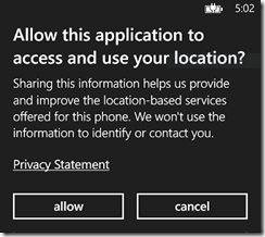
Let’s say we want to recreate this dialog:
Via Code-Behind
One way to go about it would be to create all the custom content inline at the time of invocation:
|
|
The HyperlinkButton is created in code, tilt effect is set on the HyperlinkButton and to hook it together the HyperlinkButton is assigned to the Content property.
Via XAML
Another approach is to create it as a DataTemplate in either the page or application resources and when you configure the dialog set the ContentTemplate property which may prove easier for more complicated templates.
|
|
Now the code-behind looks like this:
|
|
More Samples
You can find more examples, including the source to the “What Can I Say?” screenshot I showed above, in the Toolkit Samples project which you can either get via downloading the latest source or looking at it directly on CodePlex.
As always feedback is appreciated via either comments here or on CodePlex. We review each piece of feedback and we do get to them, if sometimes a little later than we’d like. Our goal is to make it so you can focus on writing your application vs. having to recreate the UI you see on the phone.


